Project Details
Overview
RESS (Regista Sport Supply) is a sport apparel brand that merges football culture with bold design. Focused on custom kits, modern fits, and durable materials, RESS delivers high-performance gear that helps teams express their identity on and off the field.
Scope of Work
Brand Identity, Visual System, Web Design, E-Catalog, Digital & Print Assets.
Duration
4 weeks.
In a crowded market of uniform suppliers, RESS needed to stand out using more than just quality products. The brand needed a unique visual identity and a story that resonates with modern athletes. It had to feel both competitive and culturally relevant. We focused on blending performance-driven function with design-forward style. This approach would help connect deeply with grassroots teams and emerging clubs. We aimed to build a sportswear brand that works for both pro-level and community teams. The brand identity needed to be bold, easy to recognize, and consistent across all brand touchpoints. It also had to remain flexible enough to allow team-level customization.
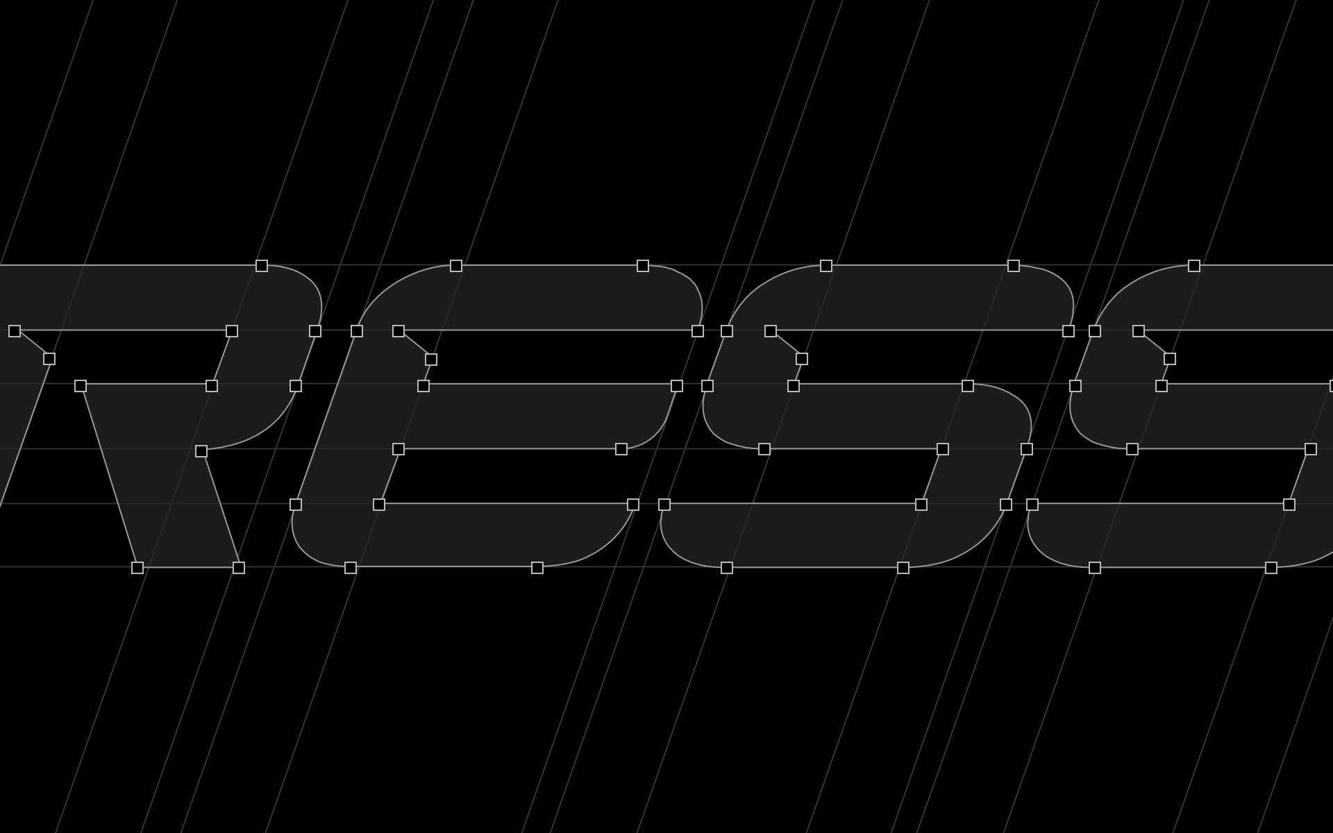
I set out to design a brand identity that feels as powerful and purposeful as the athletes who wear it. My goal was to create a system that not only stands out in the competitive sportswear landscape but also adapts seamlessly across different teams, kits, and digital platforms.
To achieve this, I focused on building a clear visual language rooted in motion, strength, and unity. Every design decision, from the logo elements to the color choices, was made to reflect the spirit of high-performance sport while remaining practical for real-world application. The result is a flexible and bold identity system that elevates the RESS brand across every level of the game.
Visual Direction
I created a visual style that feels athletic and modern. I made the system minimalist. It uses high contrast, clean space, and sharp angles. These choices reflect the discipline of sport and support visual clarity. I made sure everything balances function and emotion. The system adapts well across digital screens, apparel, and team-branded materials.
Color Palette
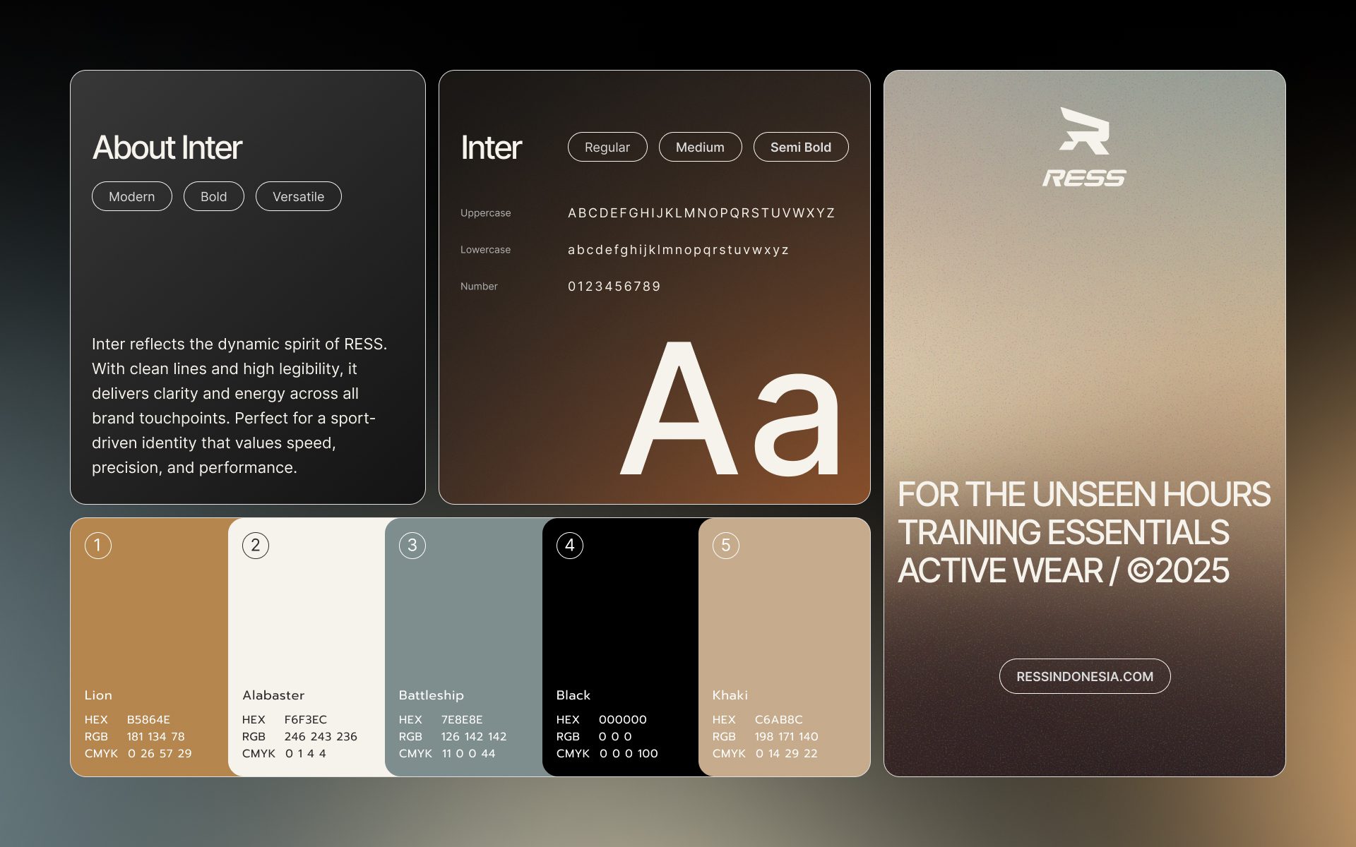
I chose colors that blend energy and warmth. Lion and Khaki form the core of the brand palette. They feel strong and grounded. Alabaster and Battleship serve as neutral backgrounds, improving clarity in design. Black anchors the palette. It adds bold contrast and a sense of authority.
Typography
I picked Inter as the type system for its readability and modern look. It works well at all sizes. Headings use heavier weights to create visual presence. Body text uses lighter weights for easier reading. The geometric letterforms match the brand’s precision-driven style. This typographic approach also supports trust and consistency in every touchpoint.
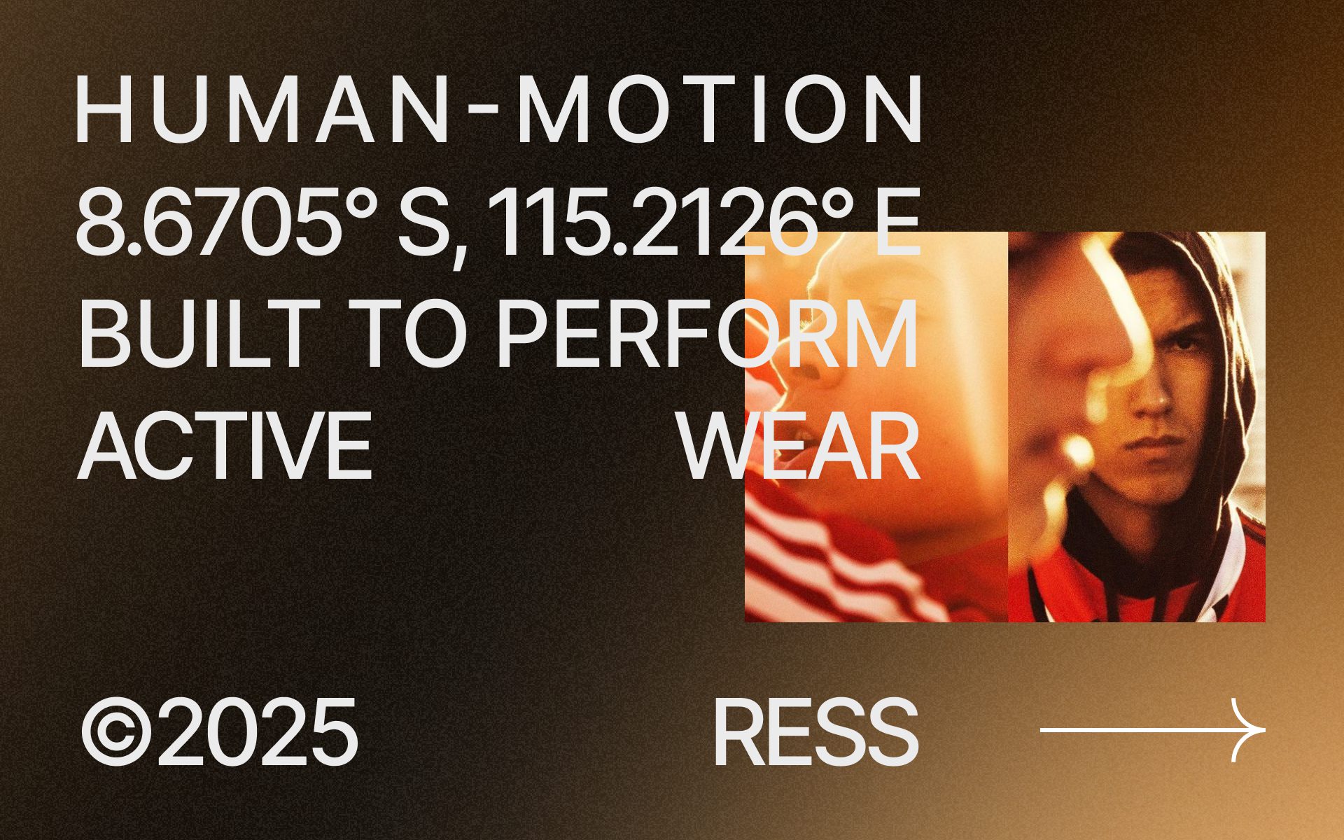
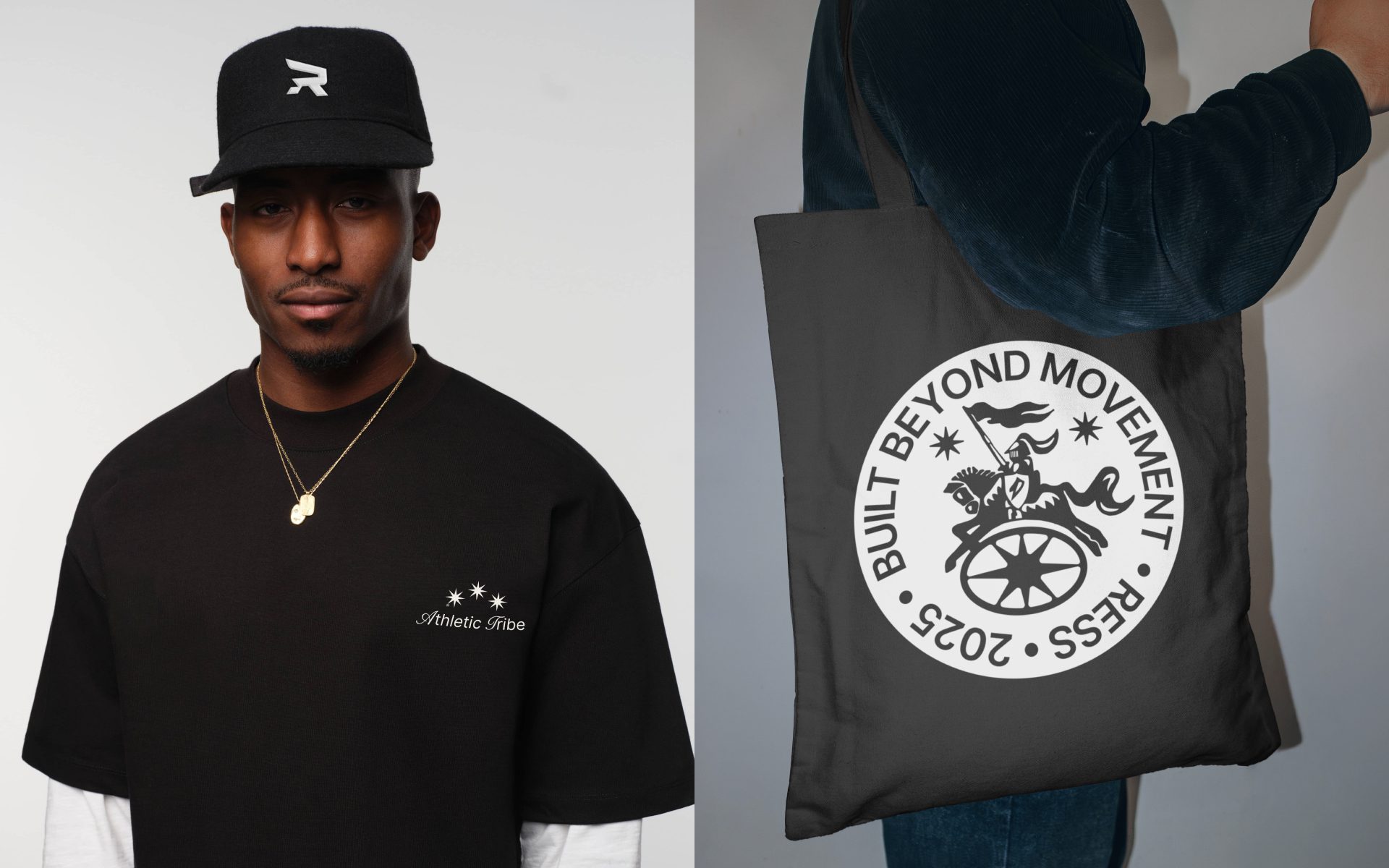
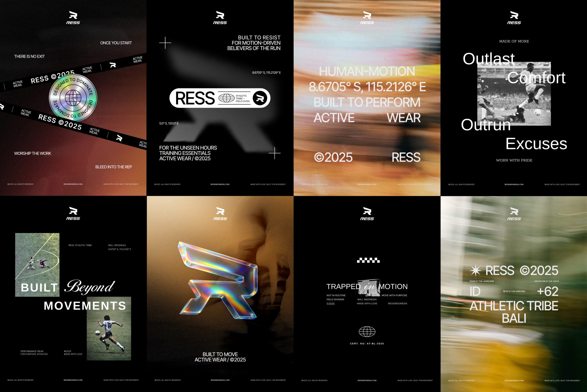
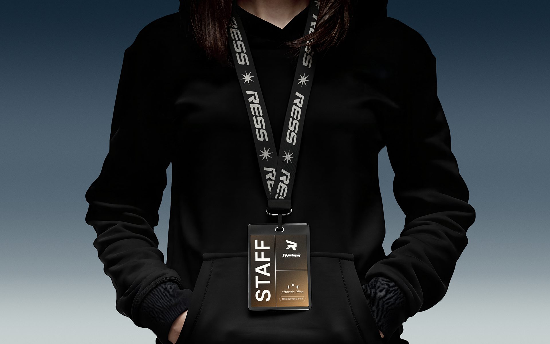
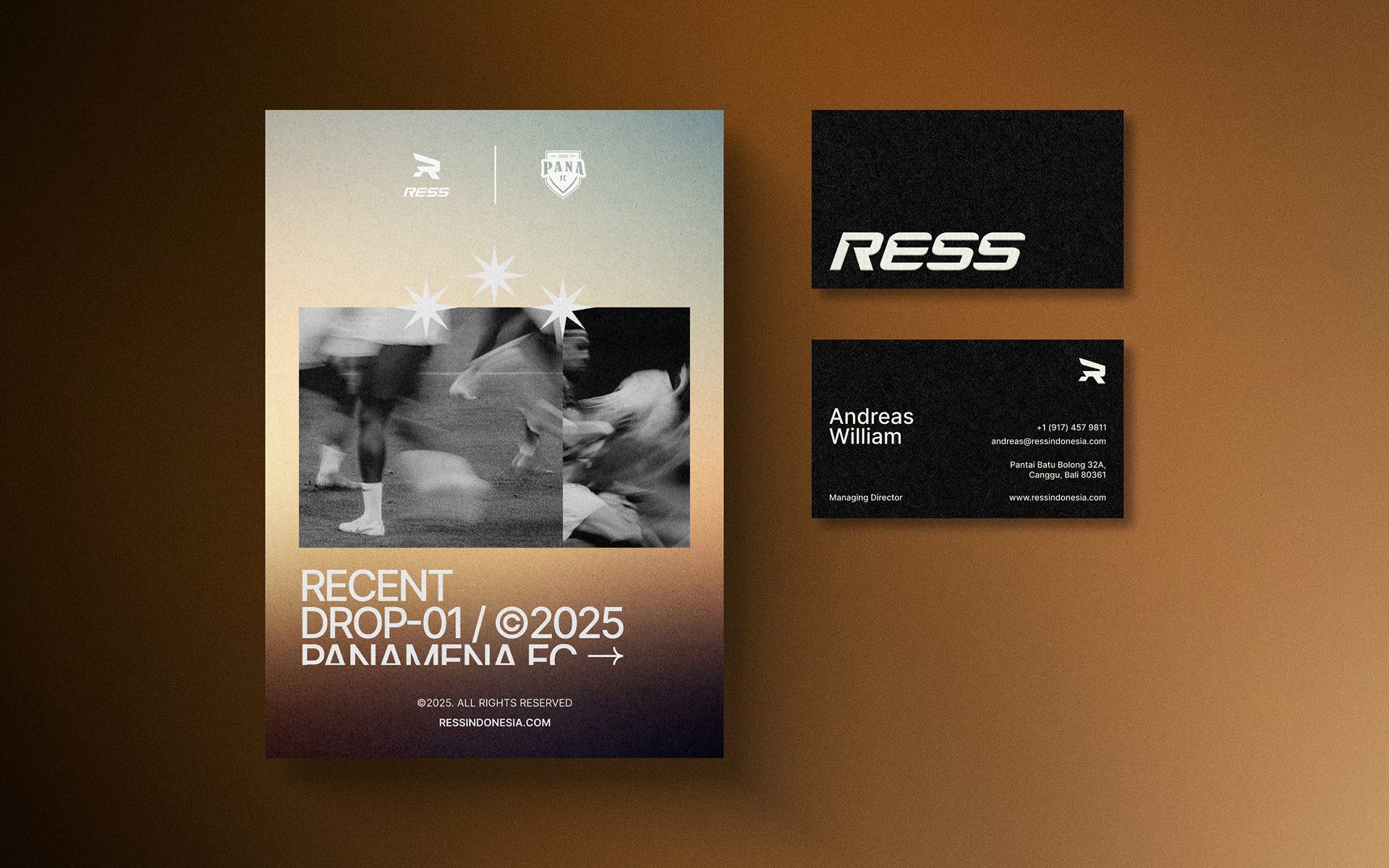
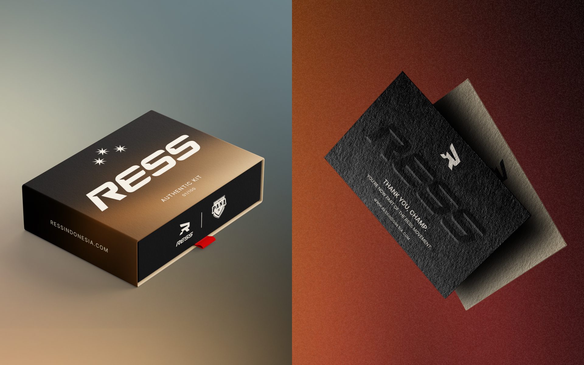
The final identity system gave RESS a bold and distinct brand presence. It works across all media, from product tags to social posts to team jerseys. The design supports both brand recognition and easy team-based customization.
This system helped RESS connect with athletes, fans, and potential partners. User engagement increased. Inquiry rates improved. Brand guidelines ensure consistent communication across all future marketing channels.
Client:
RESS
Date:
July 2025
Location:
Bali, Indonesia

