Project Details
Overview
Markies is a modern reinterpretation of the tiny-home concept, designed for mobility, comfort, and minimal environmental impact. Combining architectural precision with lifestyle-focused details, Markies offers a flexible living experience that adapts to both travel and stationary living.
Scope of Work
Brand Identity, Visual System, Web Design, Digital Assets.
Duration
4 weeks
Markies needed a unified brand identity that could balance minimal elegance with functional clarity. The goal was to design a digital presence that matched the spacious and calming feeling of the physical interiors while being mobile-first and conversion-focused for prospective buyers.
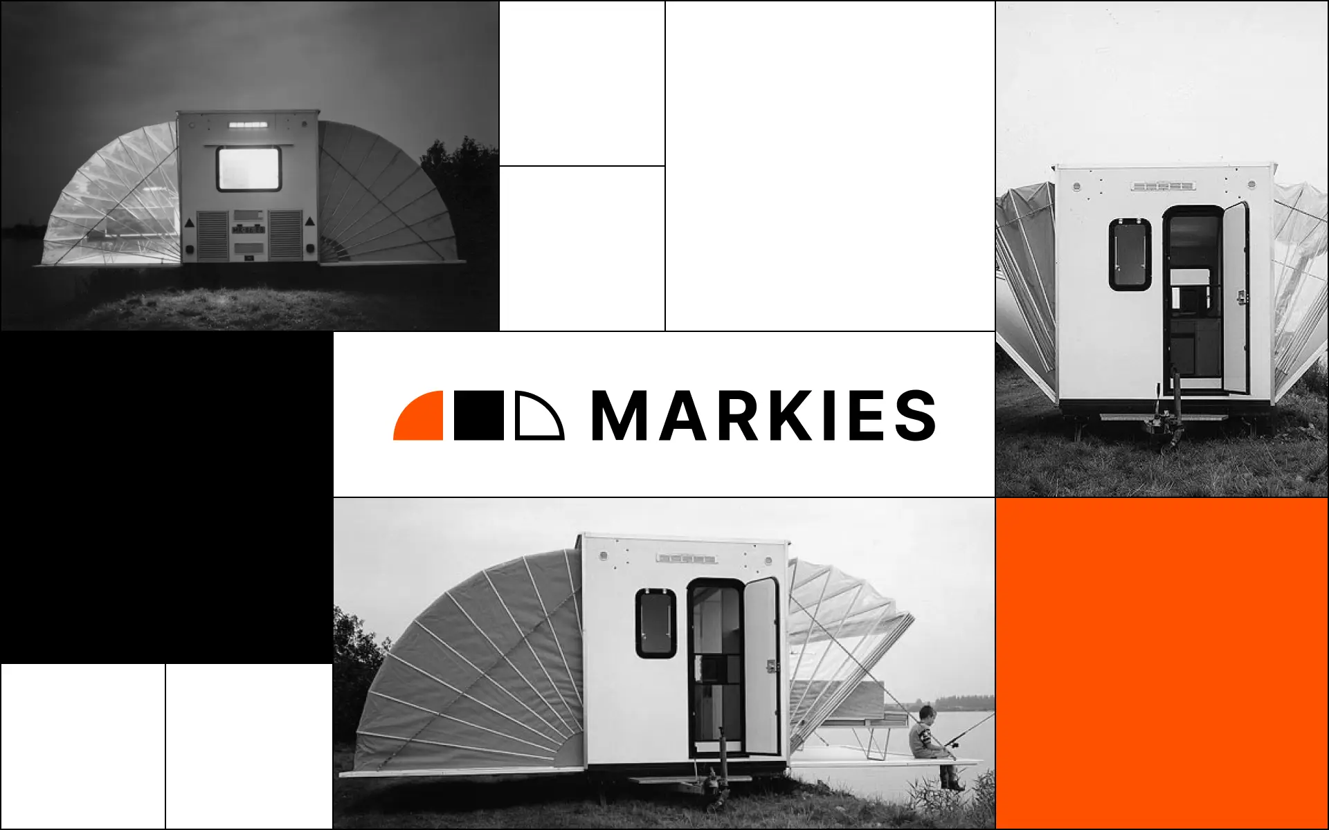
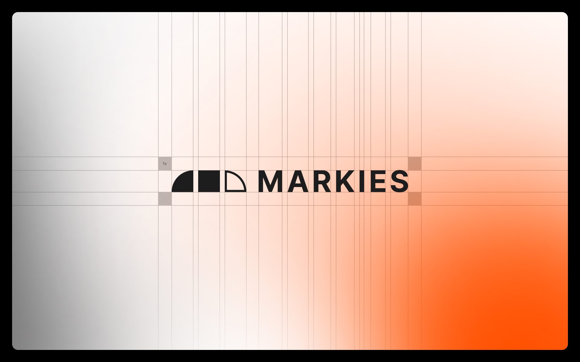
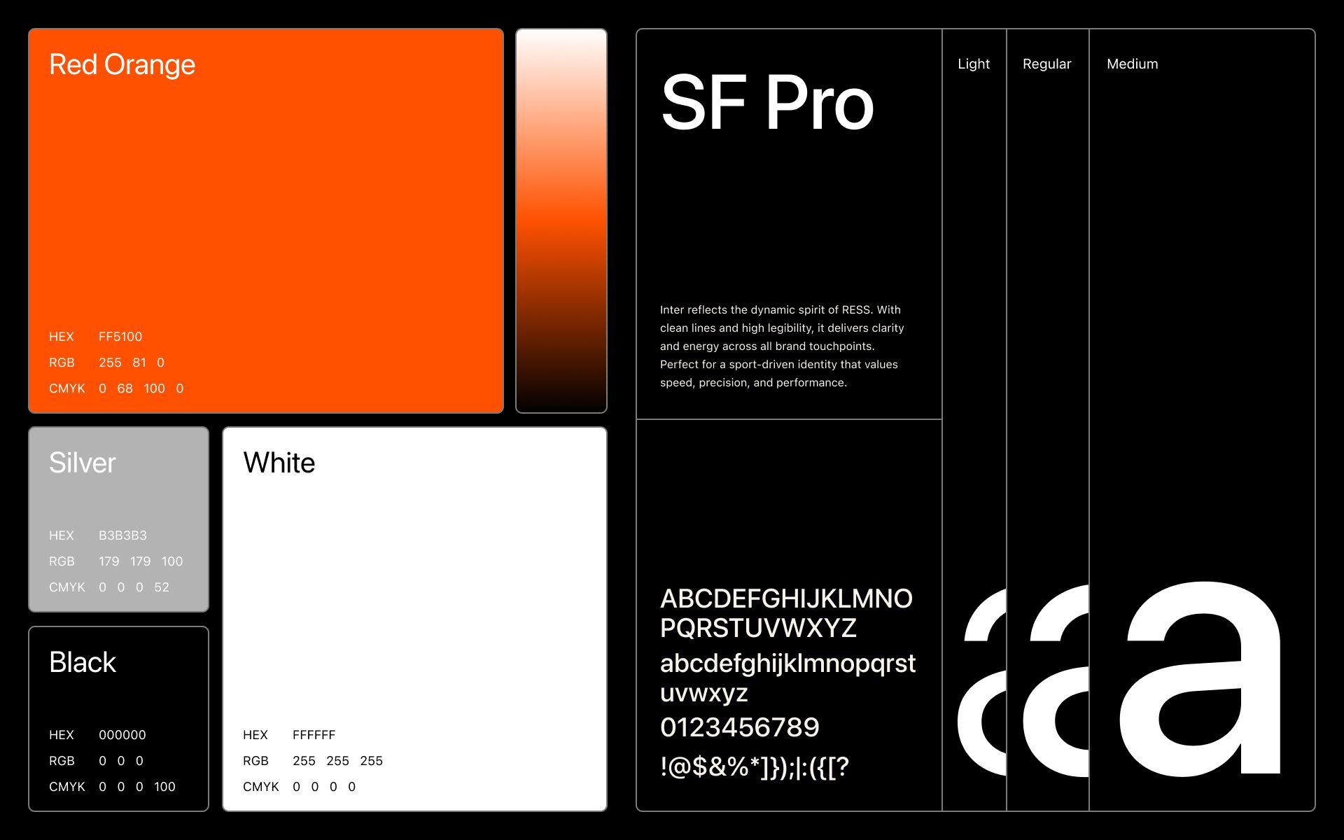
I set out to create a brand identity that could capture the energetic and bold spirit of Markies. The goal was to design a system that would feel powerful in motion and stand strong across digital and physical touchpoints. I focused on expressing confidence, speed, and modernity while making sure the brand could scale with ease. Each element, from the logo to layout systems, was designed to feel active, purposeful, and instantly recognizable.
Visual Direction
The visual direction is rooted in high energy and contemporary edge. I crafted a design language that communicates strength, innovation, and clarity. The use of bold color, minimalist structure, and generous contrast makes the identity stand out in fast-paced environments like digital campaigns, sports content, and product visuals. Every asset supports a sense of movement and power, aligning with Markies’ vision of forward momentum.
Color Palette
The Markies palette features Red Orange as the primary color to inject urgency, passion, and standout energy. It’s supported by Black and White to ground the design in clarity and contrast. Silver brings a sleek and technical touch, enhancing the brand’s modern aesthetic. This palette was selected to balance emotional impact with versatility across both screen and print.
Typography
I chose SF Pro as the primary typeface for its clean geometry, excellent readability, and modern personality. It reflects the bold clarity of the Markies brand while offering enough flexibility for both large headlines and small interface details. The type system includes Light, Regular, and Medium weights to create a hierarchy that feels structured yet energetic.
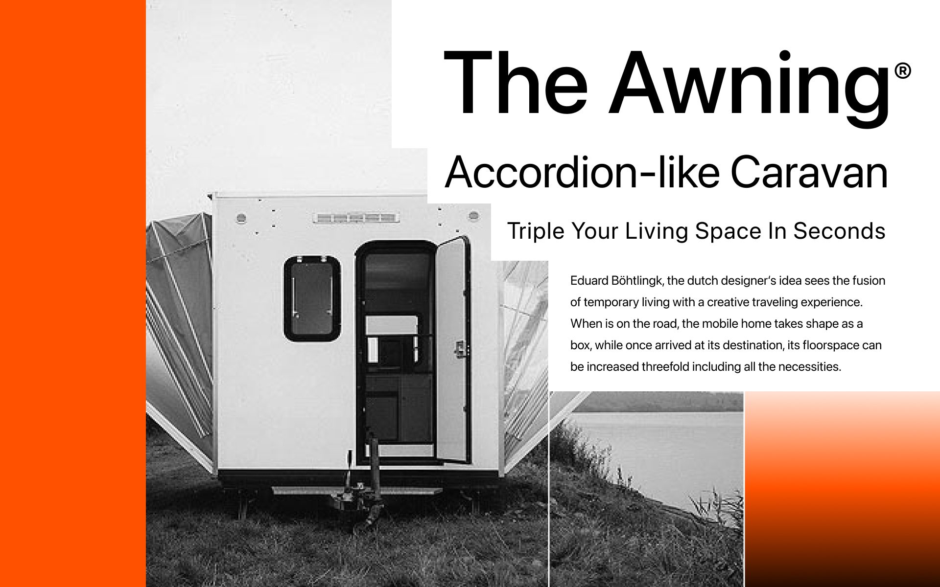
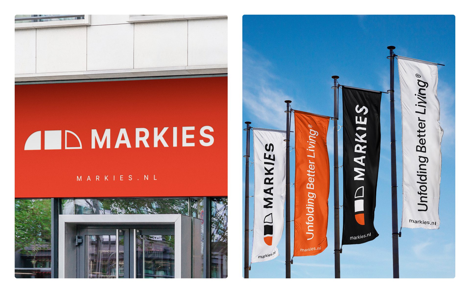
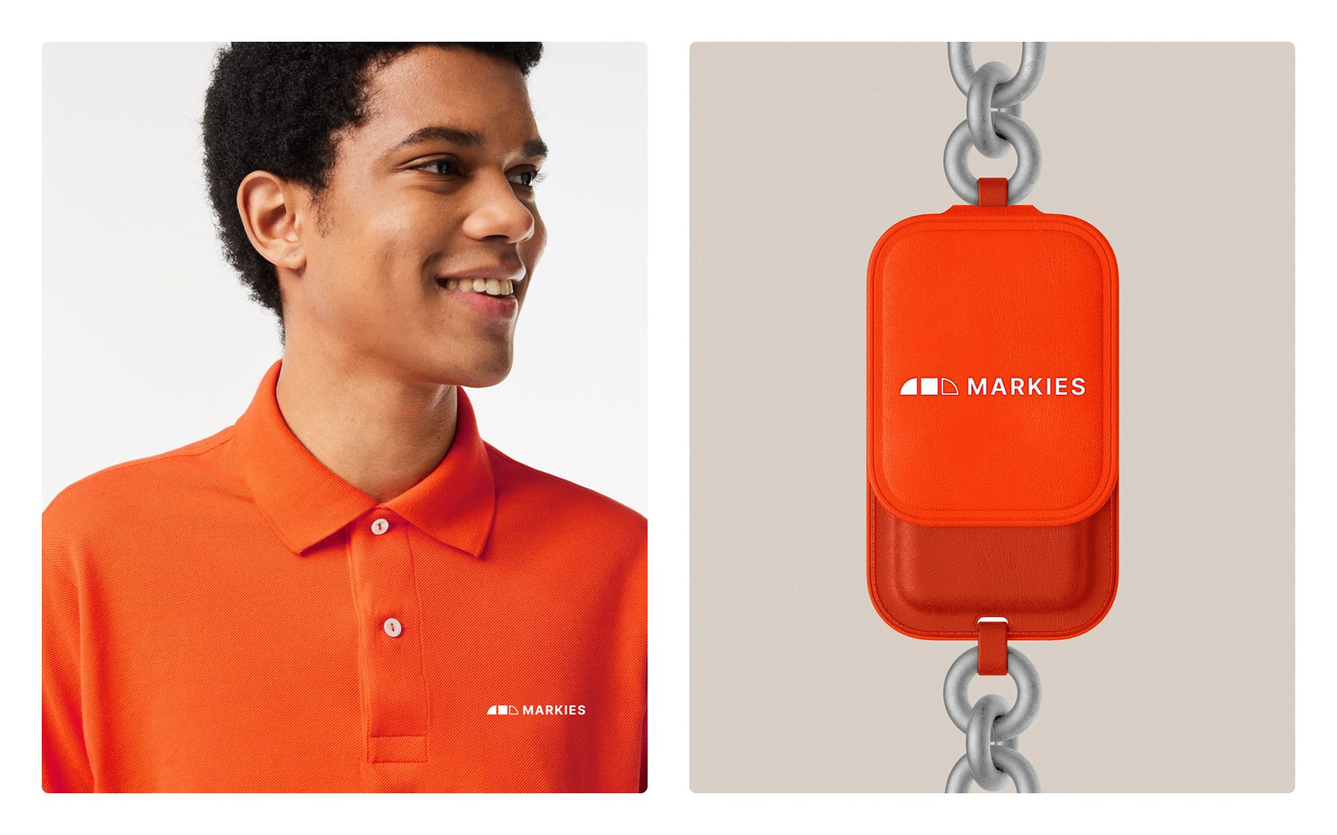
The final identity presents a sleek, dynamic system that confidently represents the Markies brand across all platforms. Whether applied to social media, digital campaigns, or printed materials, the visual language remains bold and cohesive. The color palette and typography work in harmony to express a forward-thinking, high-energy personality that resonates with the Markies’ audience. This foundation supports consistent brand storytelling while allowing flexibility for future growth. The resulting identity and website establish a high-end yet approachable presence, reflecting Markies’ core values of mobility, simplicity, and comfort. The redesign led to increased user engagement and inquiries, while the comprehensive brand guidelines ensure clarity and consistency across all future communications.
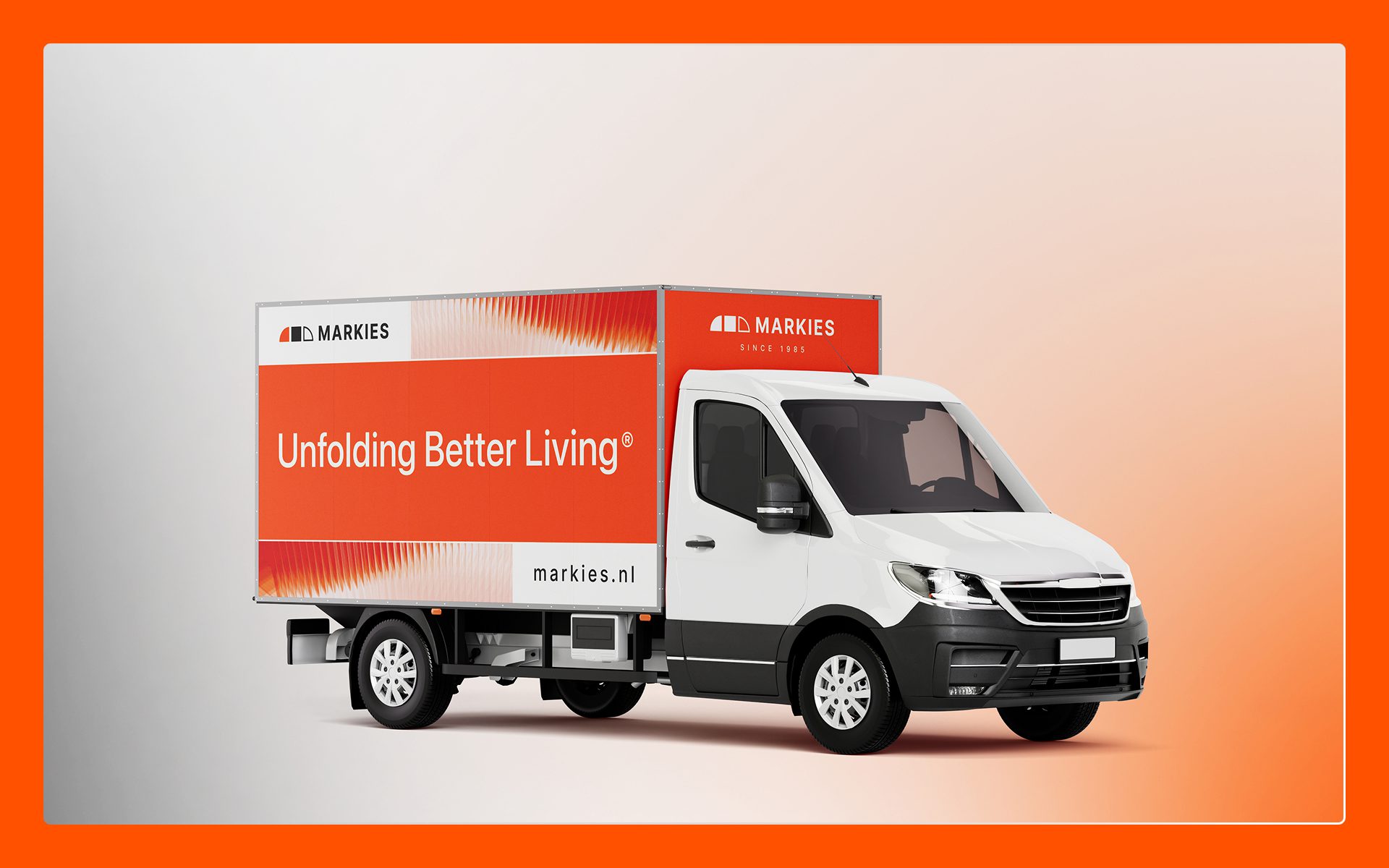
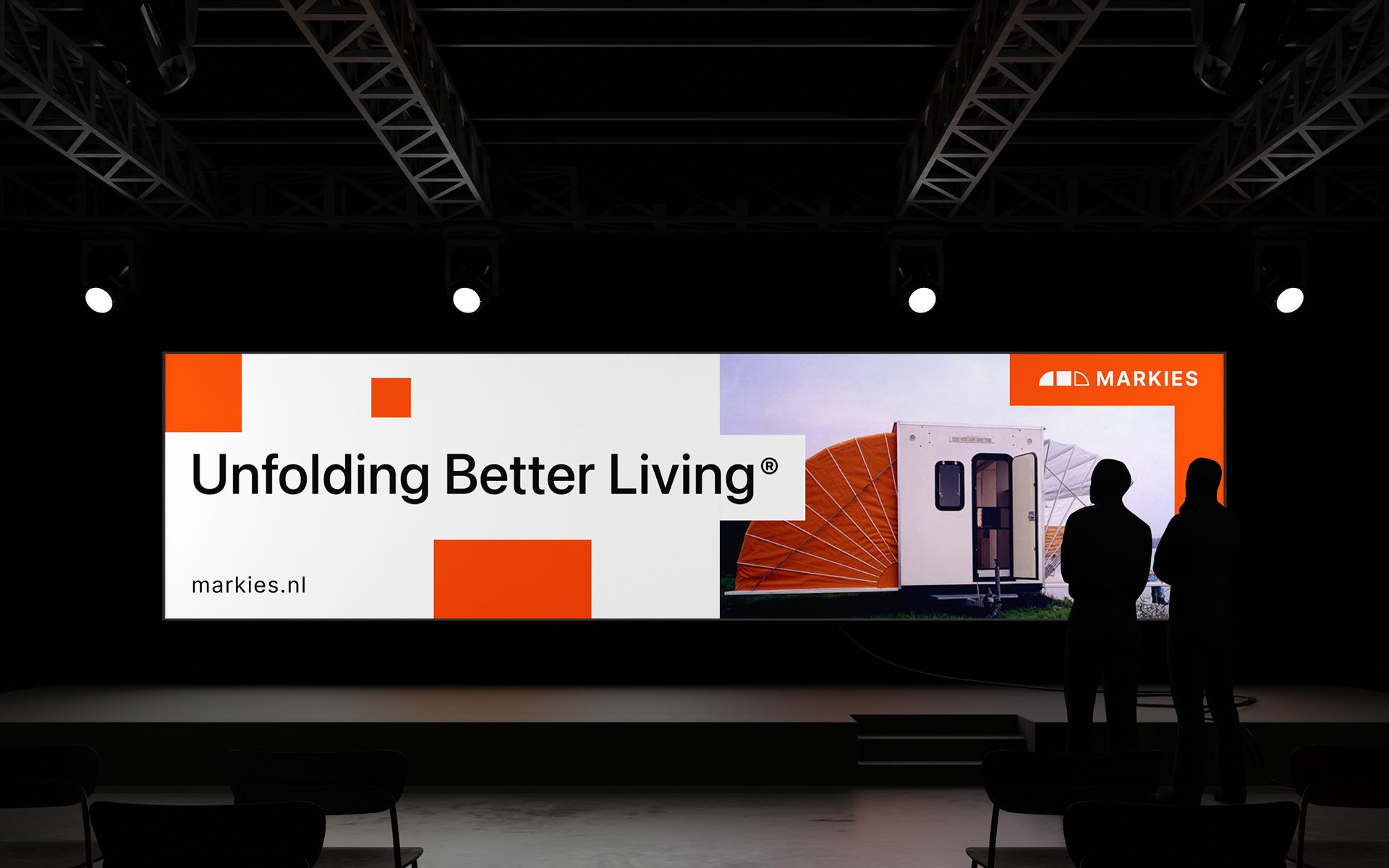
Unfolding Better Living serves as both a strategic message and a visual storytelling anchor for the Markies brand. The word Unfolding directly references the core function of the product, the physical transformation of the unit, while also symbolizing adaptability, movement, and expansion. Paired with Better Living, the slogan positions Markies not just as a mobile living unit but as a catalyst for an elevated and simplified lifestyle.
Visually, it inspires a dynamic identity system built on modular elements, expanding forms, and progressive transitions that reflect the unfolding experience. This unified narrative allows the brand to communicate its promise of mobility, comfort, and freedom across all platforms, delivering a lifestyle shift rather than just a product.
Client:
Markies
Date:
October 2021
Location:
Maasland, Nederland

