Project Details
Overview
Bakewell is an artisan bread brand with an emphasis on rich flavor and honest ingredients. This project involved crafting a complete brand identity that reflects the brand’s nostalgic charm, handmade quality, and warm personality.
Scope of Work
Brand Identity, Visual Direction, Digital & Print Assets.
Duration
2 weeks.
Translating Bakewell’s home-style baking into a refined yet approachable visual identity was a key focus. The goal was to ensure the brand felt elevated without losing its heartfelt and cozy appeal. Additionally, the brand needed to stand out in a competitive market saturated with minimalist bread brands while maintaining a distinctively personal and story-driven tone.
The creative direction was guided by the feeling of comfort and joy that comes from homemade breads. The brand identity is built around warmth, approachability, and timelessness. Elements were chosen to strike a balance between rustic and refined, inspired by vintage patisserie packaging and traditional recipe books. Every touchpoint was designed to feel inviting and genuine, creating a brand experience as delightful as the treats themselves.
Visual Direction
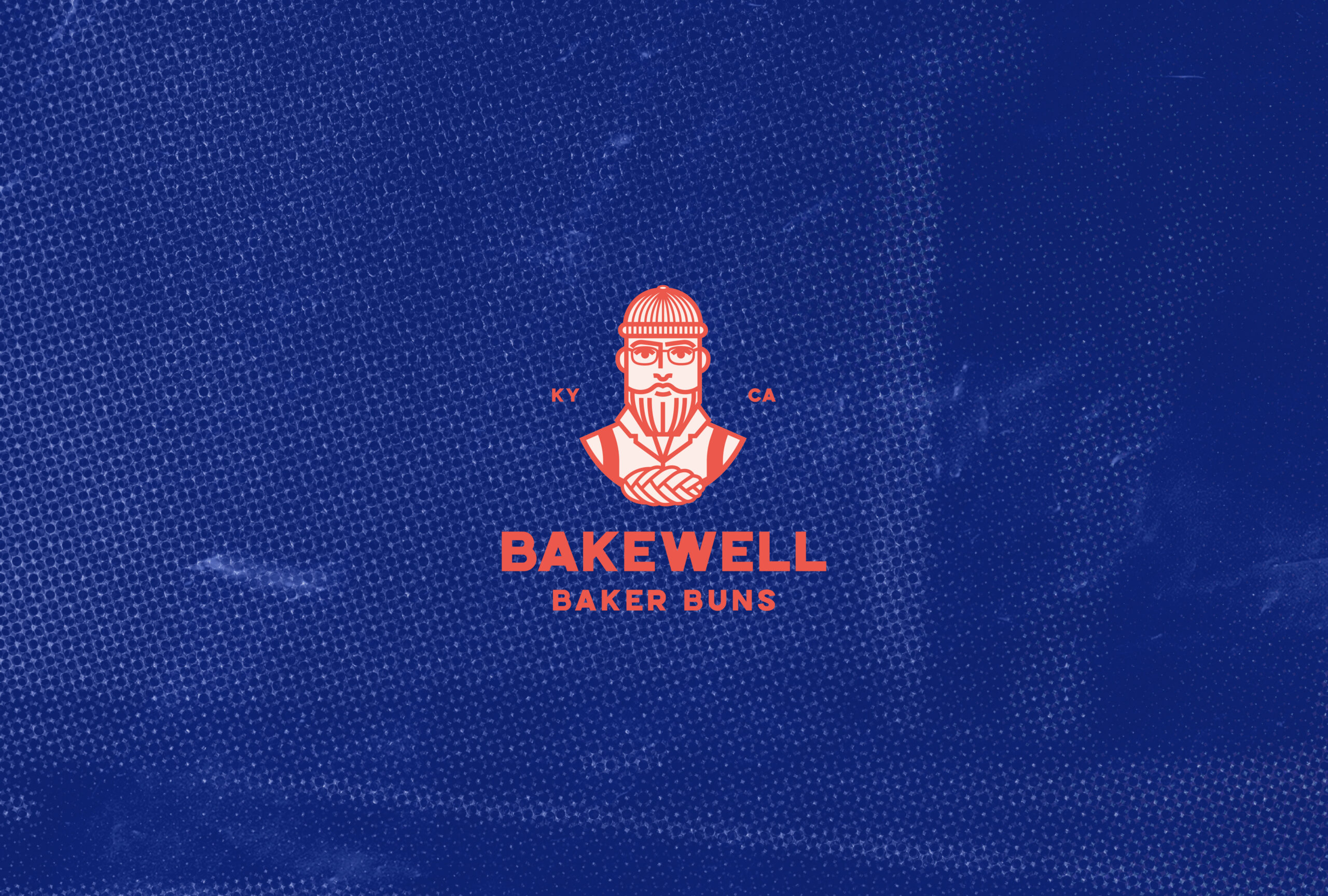
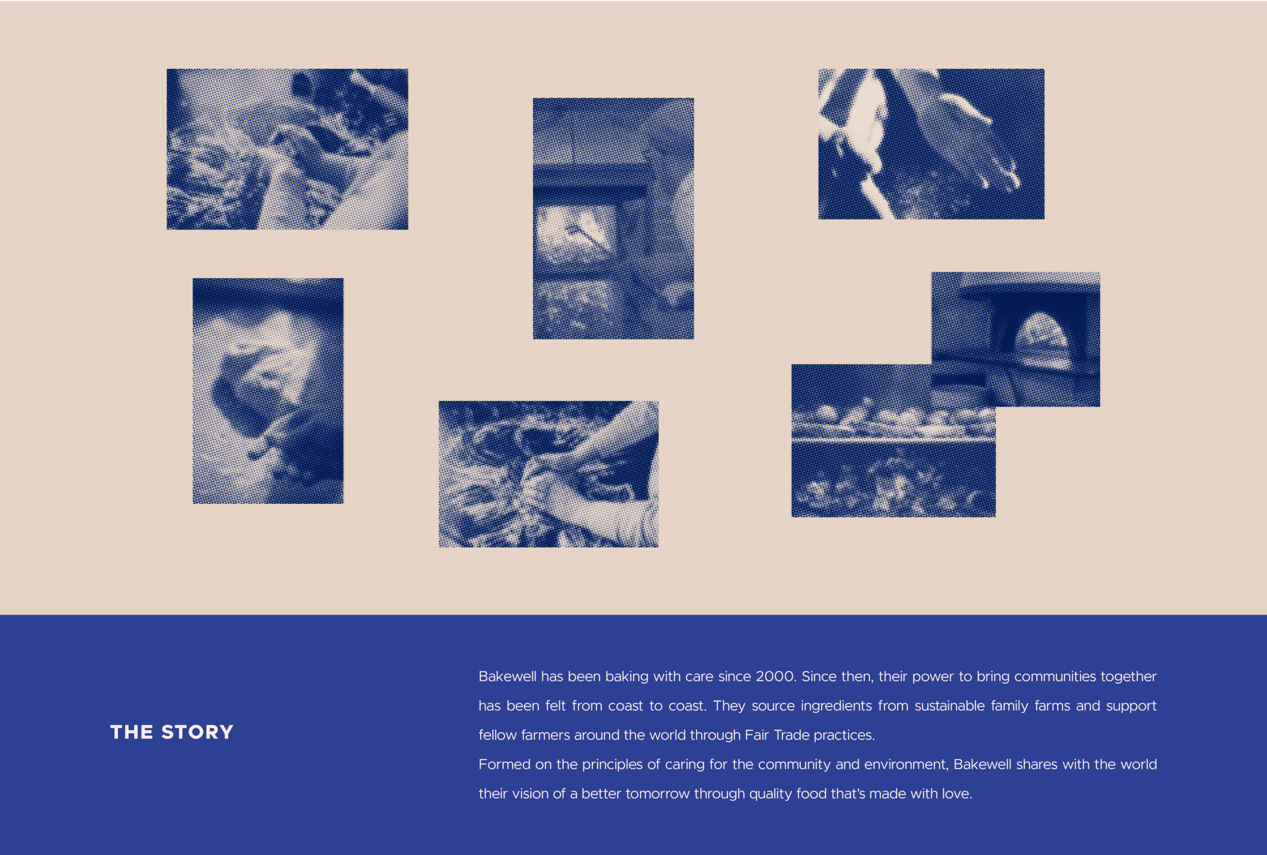
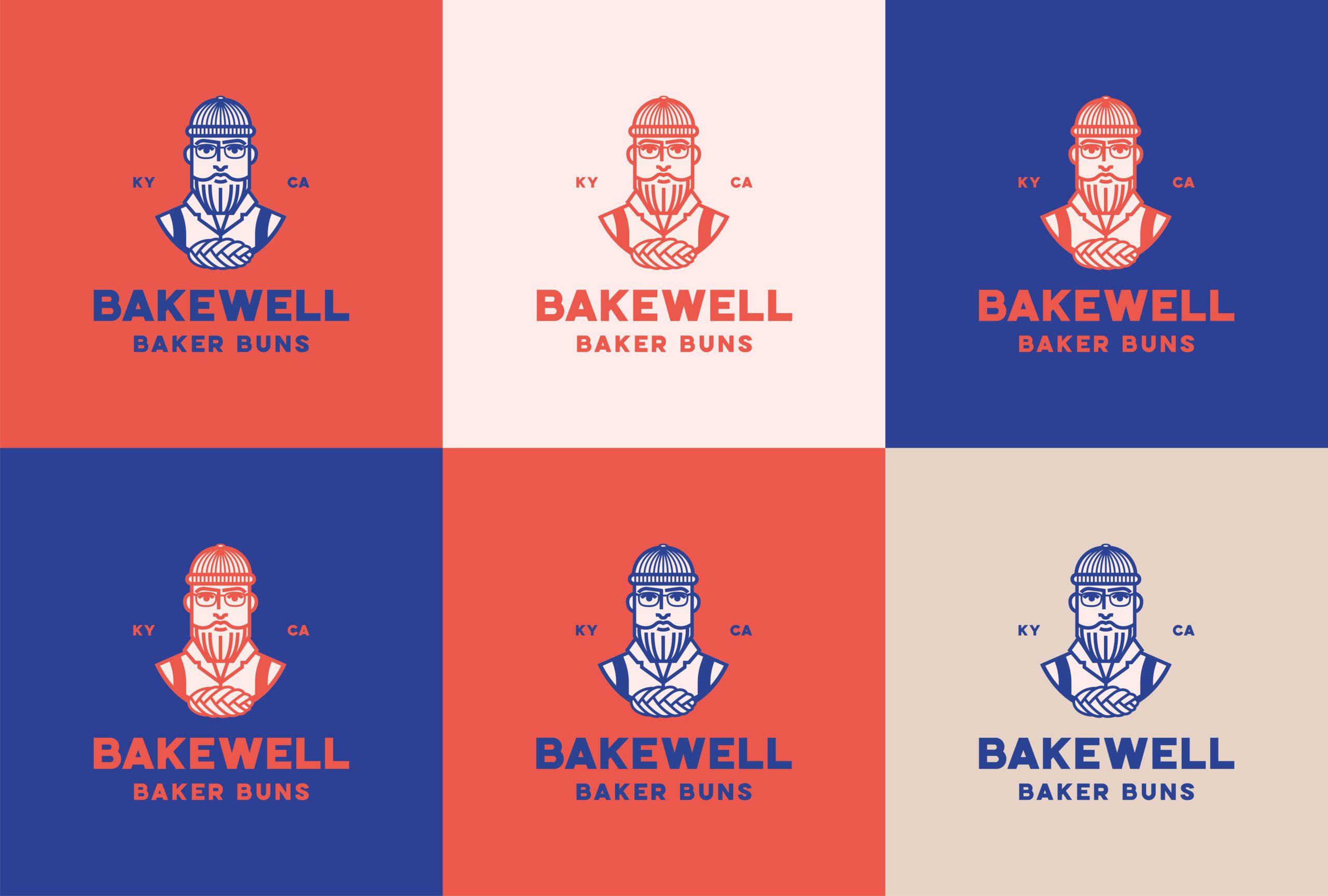
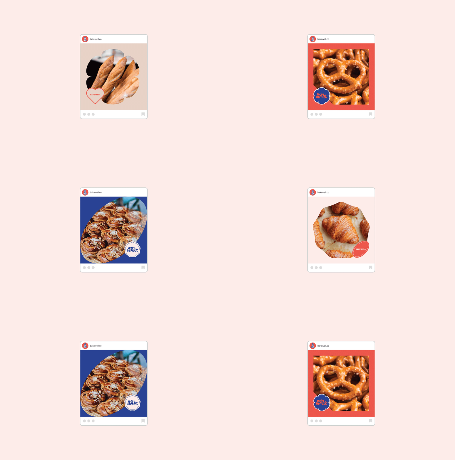
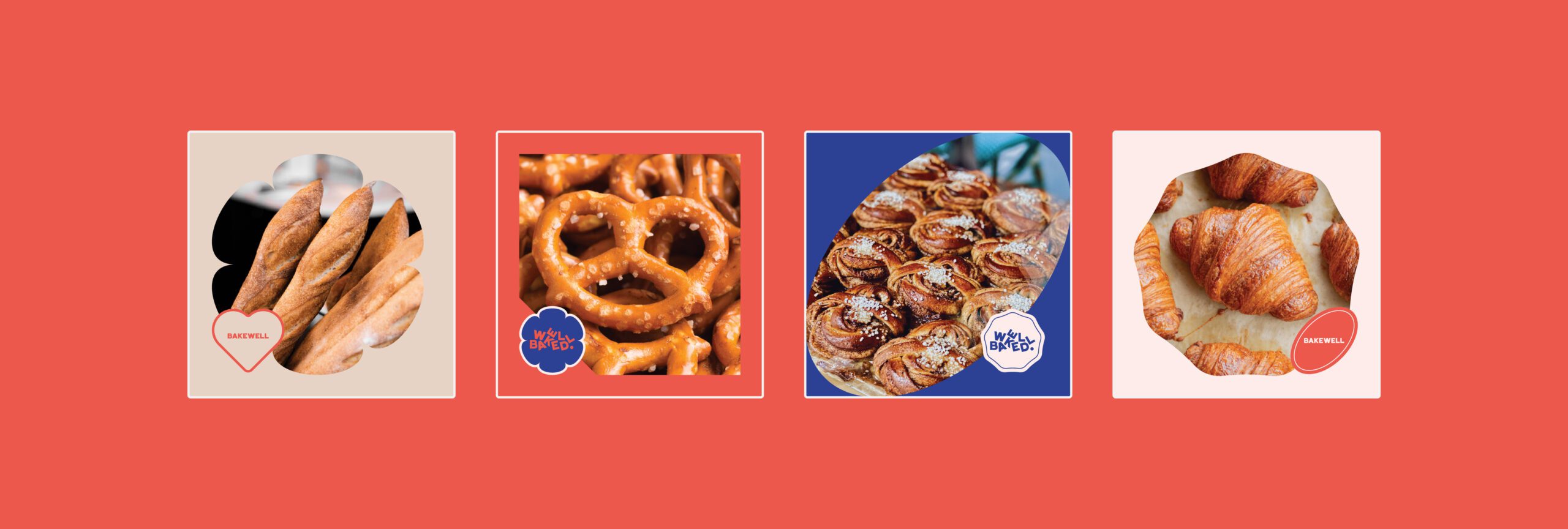
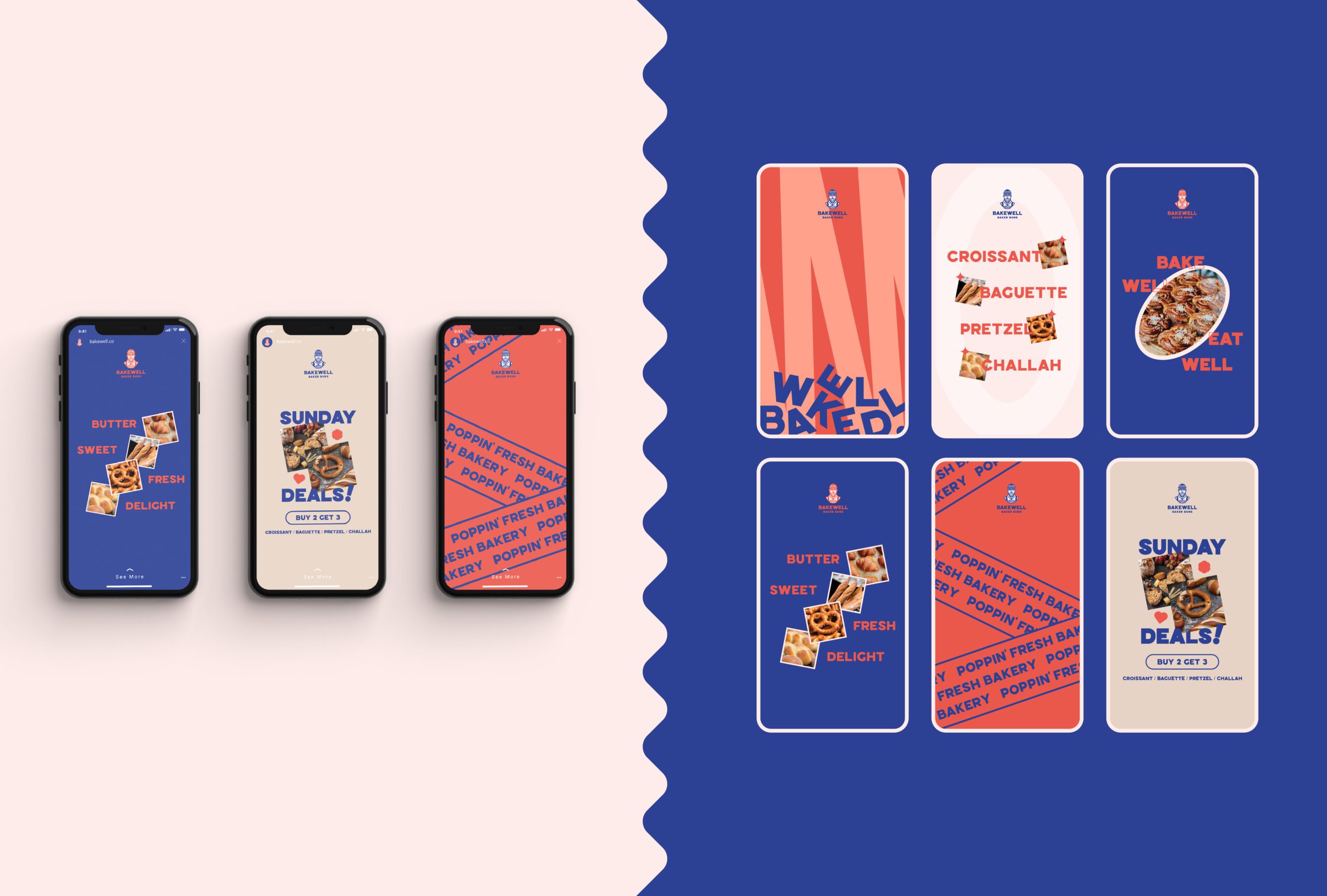
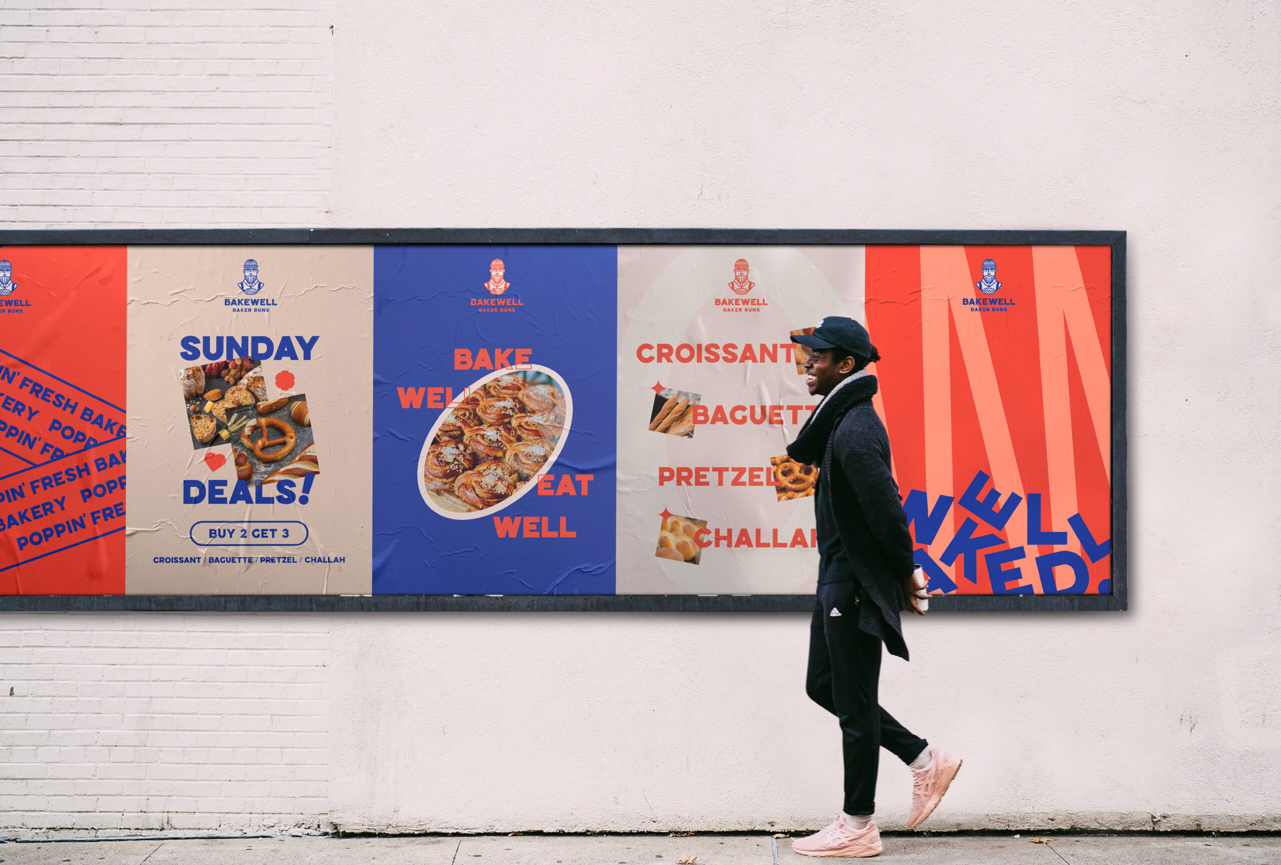
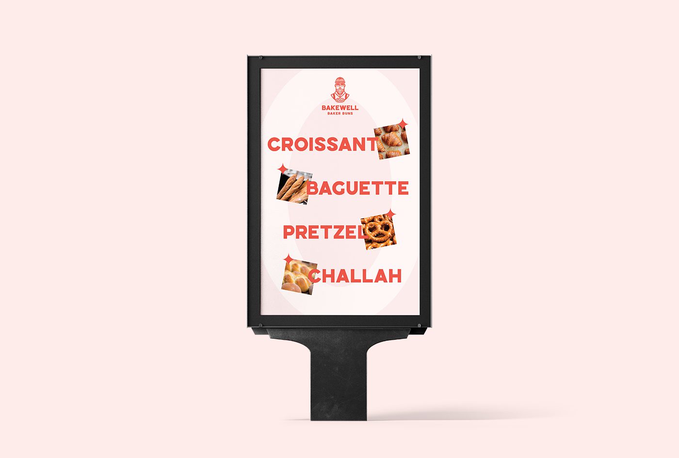
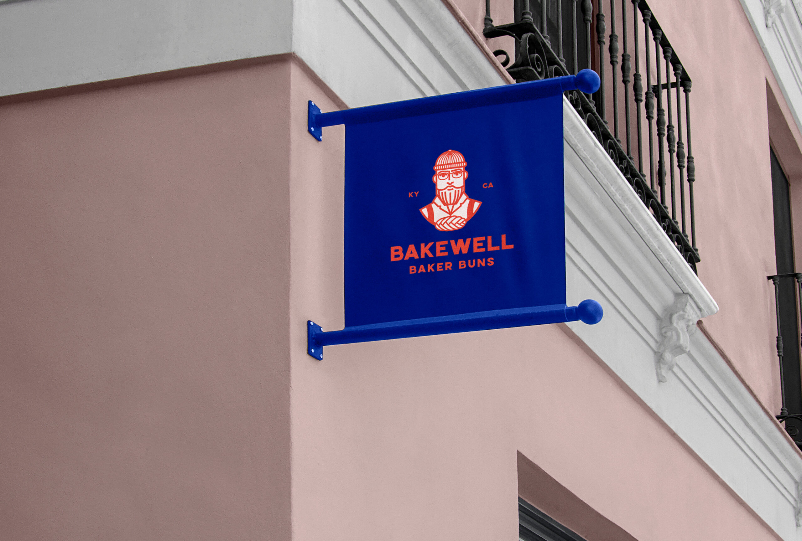
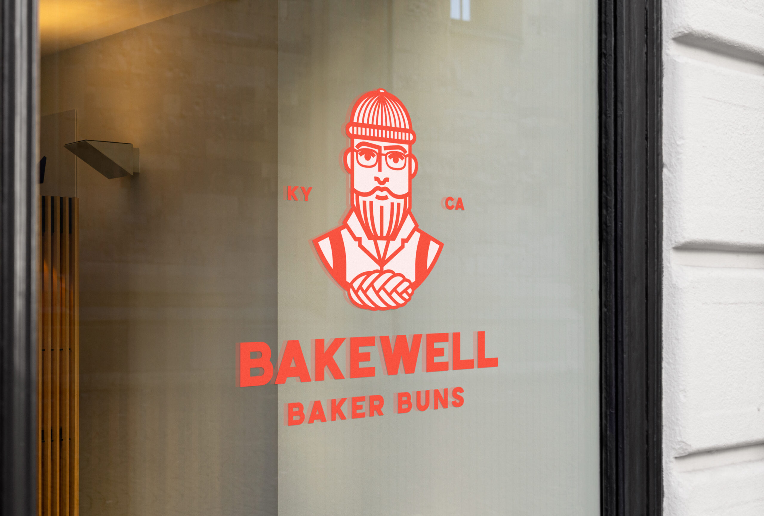
I combined heritage-inspired elements with a modern design sensibility. I illustrated a bold mascot, a baker with a braided bun, to bring charm and recognition to the brand. I used halftone photo treatments to evoke vintage cookbooks and family photo albums, adding texture and warmth. A modular grid allowed me to tell stories visually while keeping layouts clean and organized. I made sure the photography captured real baking moments and behind-the-scenes warmth so everything felt grounded and human.
Color Palette
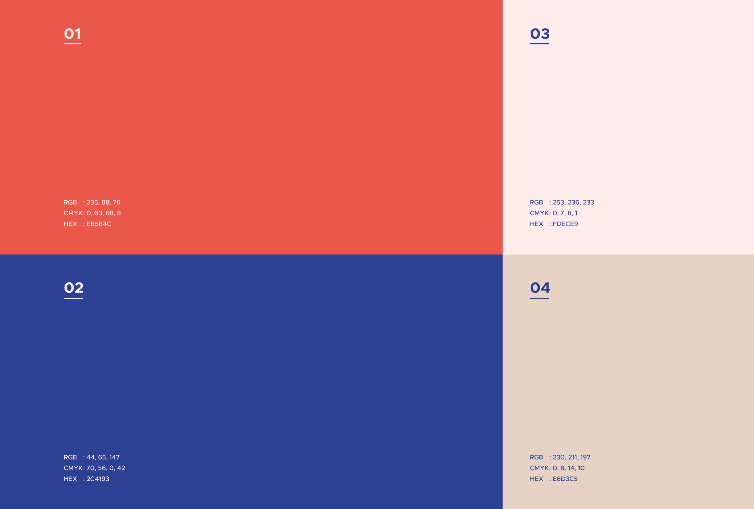
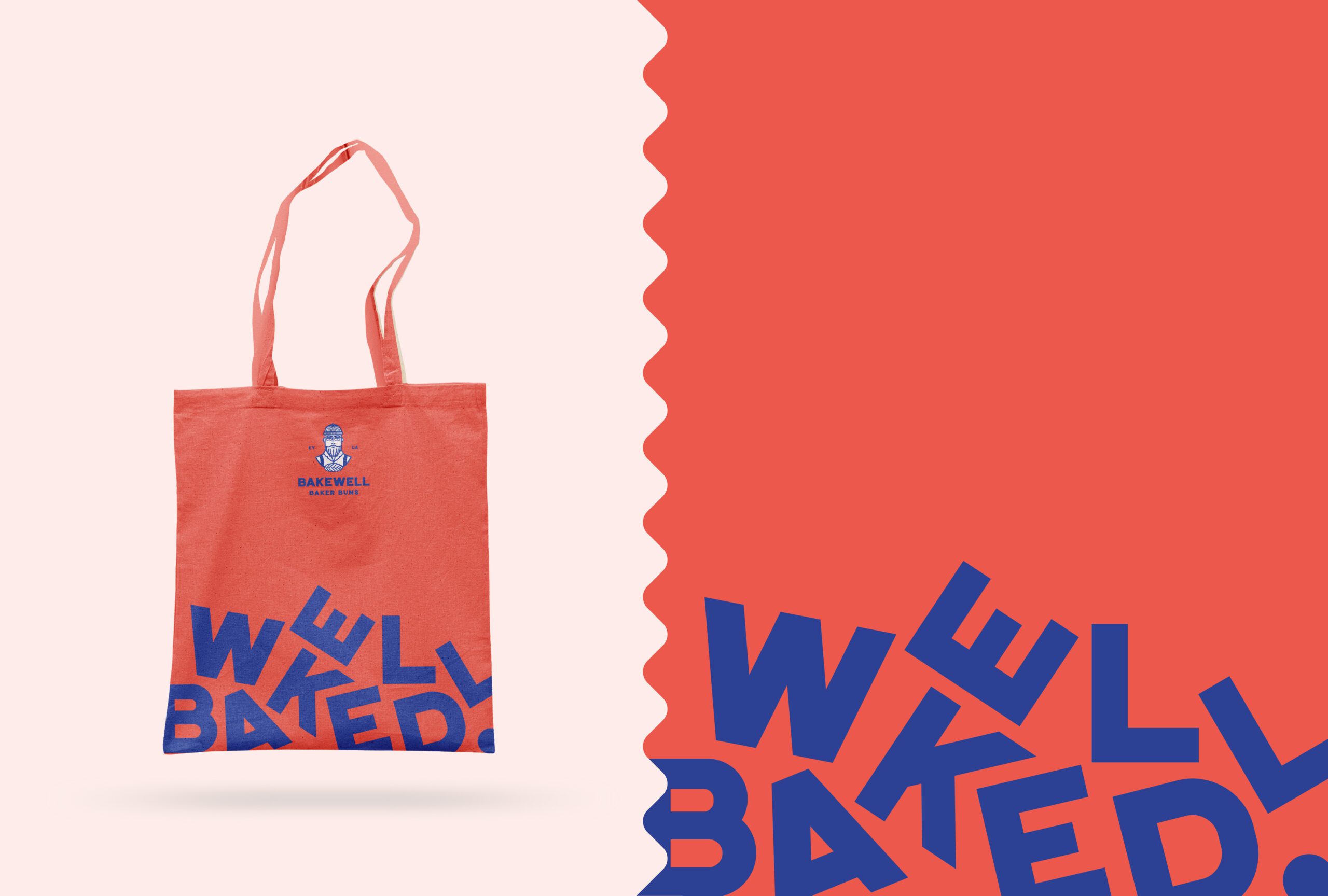
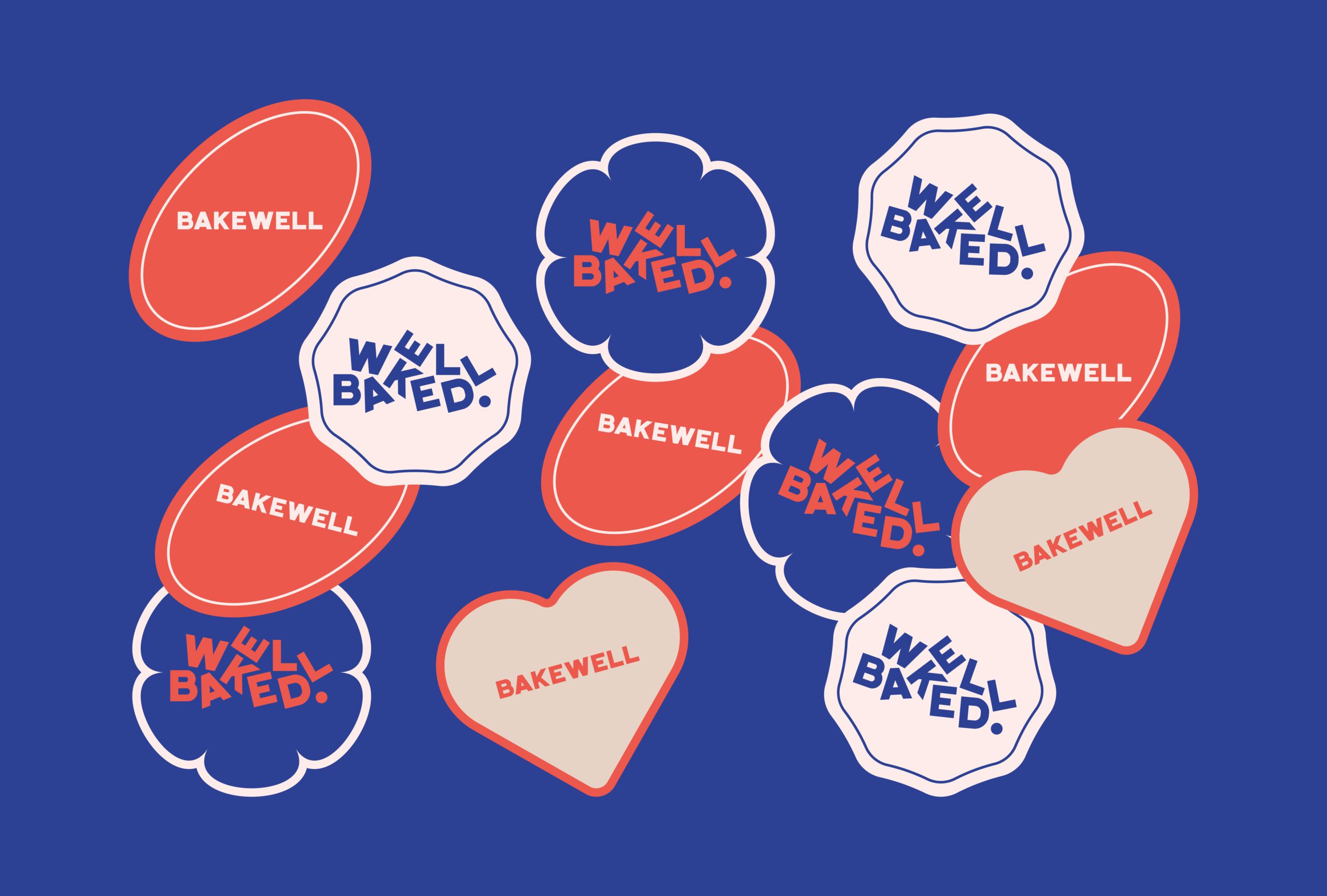
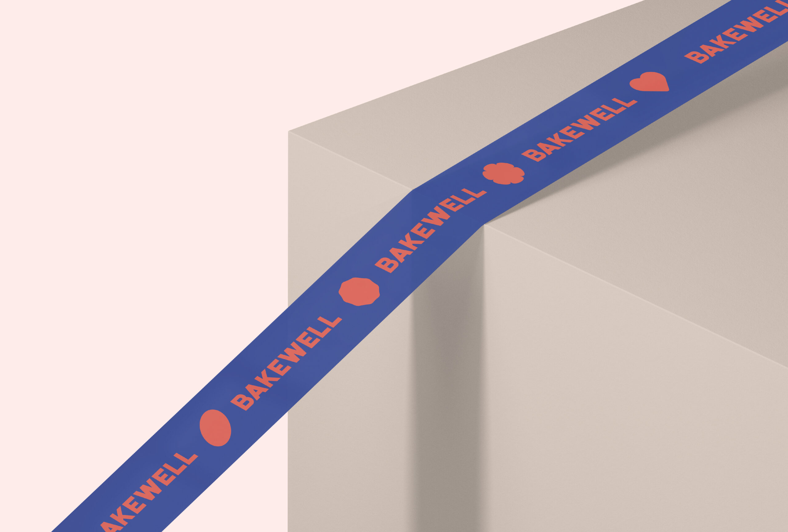
Bakewell’s color palette is distinctive and appetizing, carefully curated to express energy, trust, and warmth. A bold red acts as the primary accent, adding vitality and visual impact. Deep blue serves as the main background color, bringing stability and reliability. Soft pink introduces a playful, approachable touch, while warm beige evokes a sense of comfort reminiscent of dough and natural ingredients. Together, these colors create a visual language that feels vibrant, trustworthy, and heartwarming.
Typography
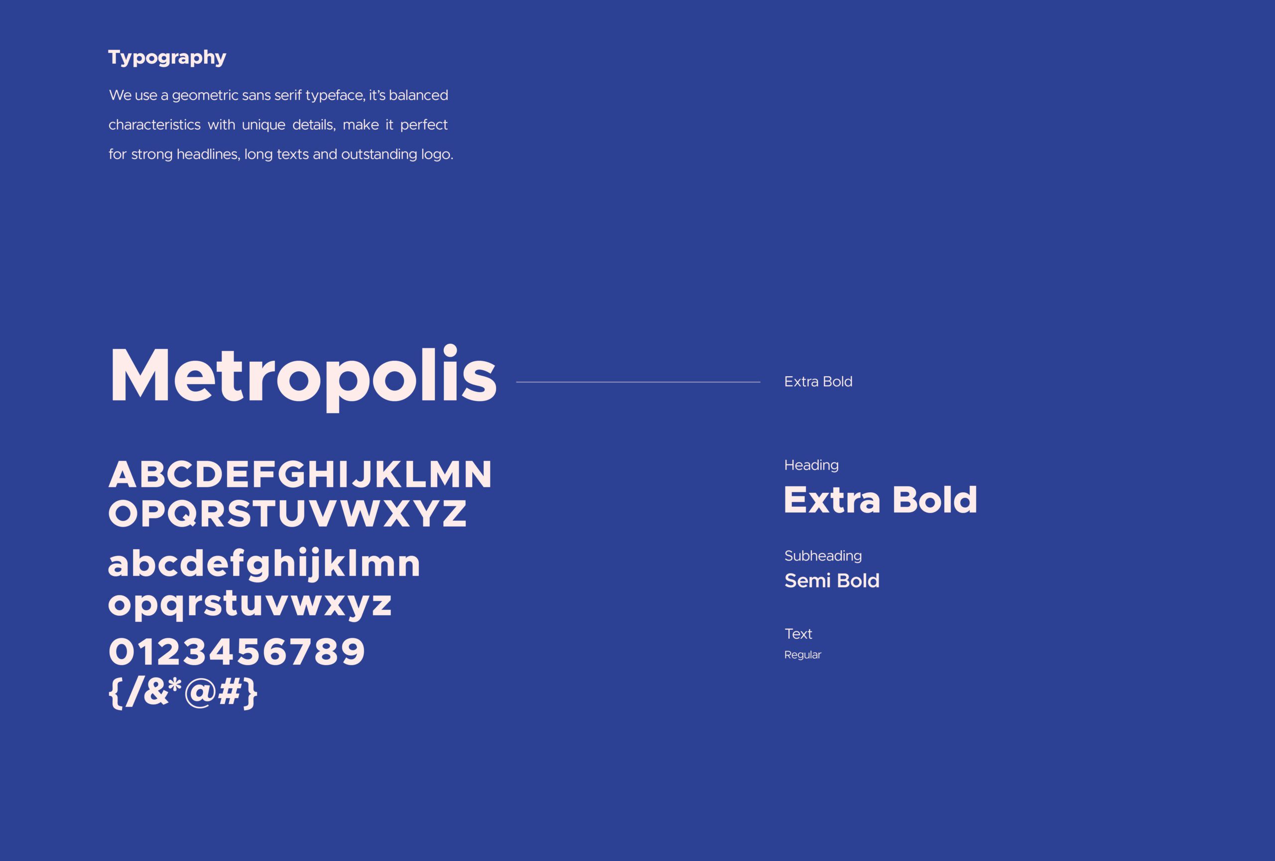
For typography, we selected Metropolis, a geometric sans-serif typeface that offers both clarity and character. Its modern structure and clean lines bring boldness and friendliness to the brand. Headings appear in Extra Bold weights to command attention, while Semi Bold subheadings maintain strong hierarchy. Regular weight ensures body text remains readable across all mediums.
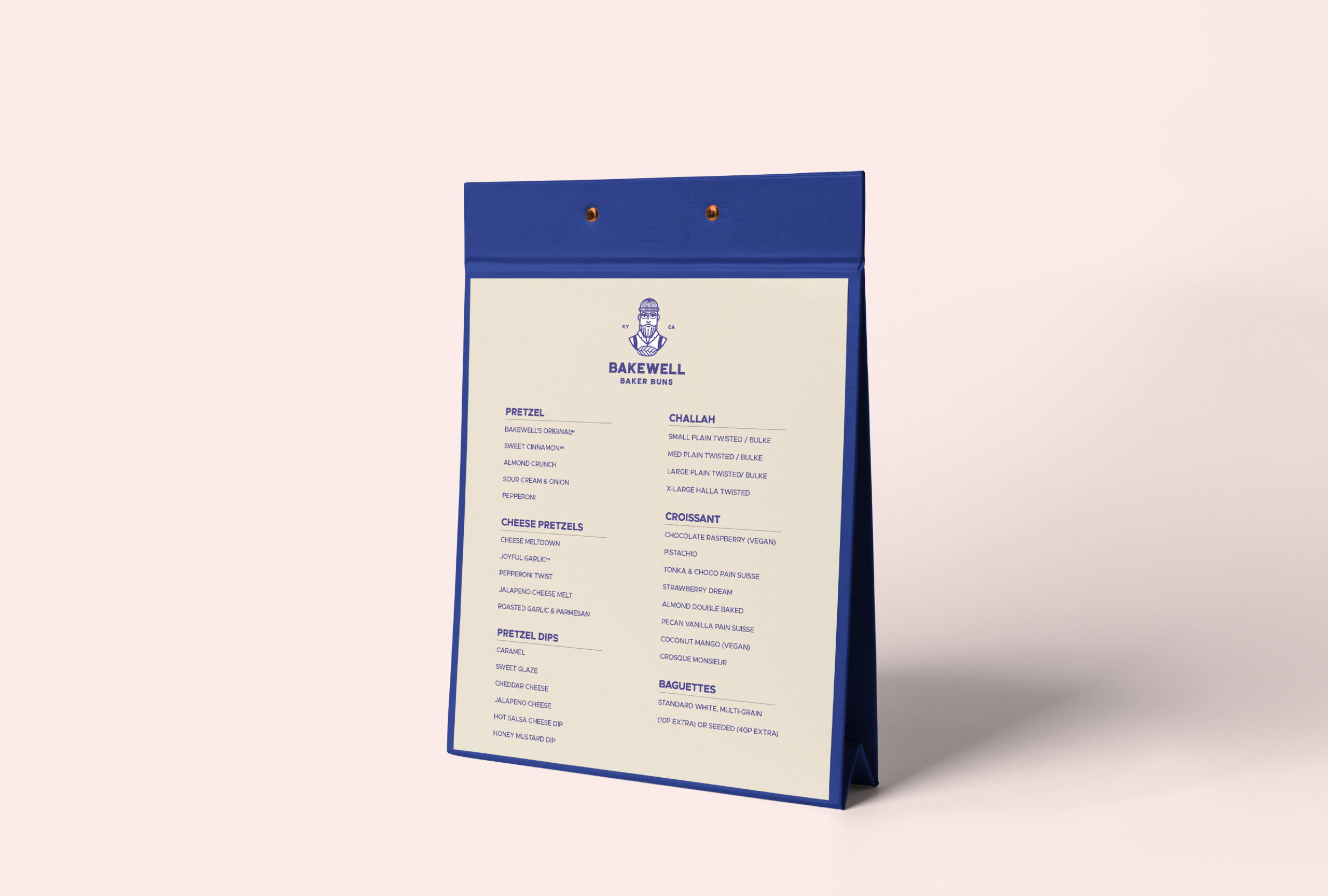
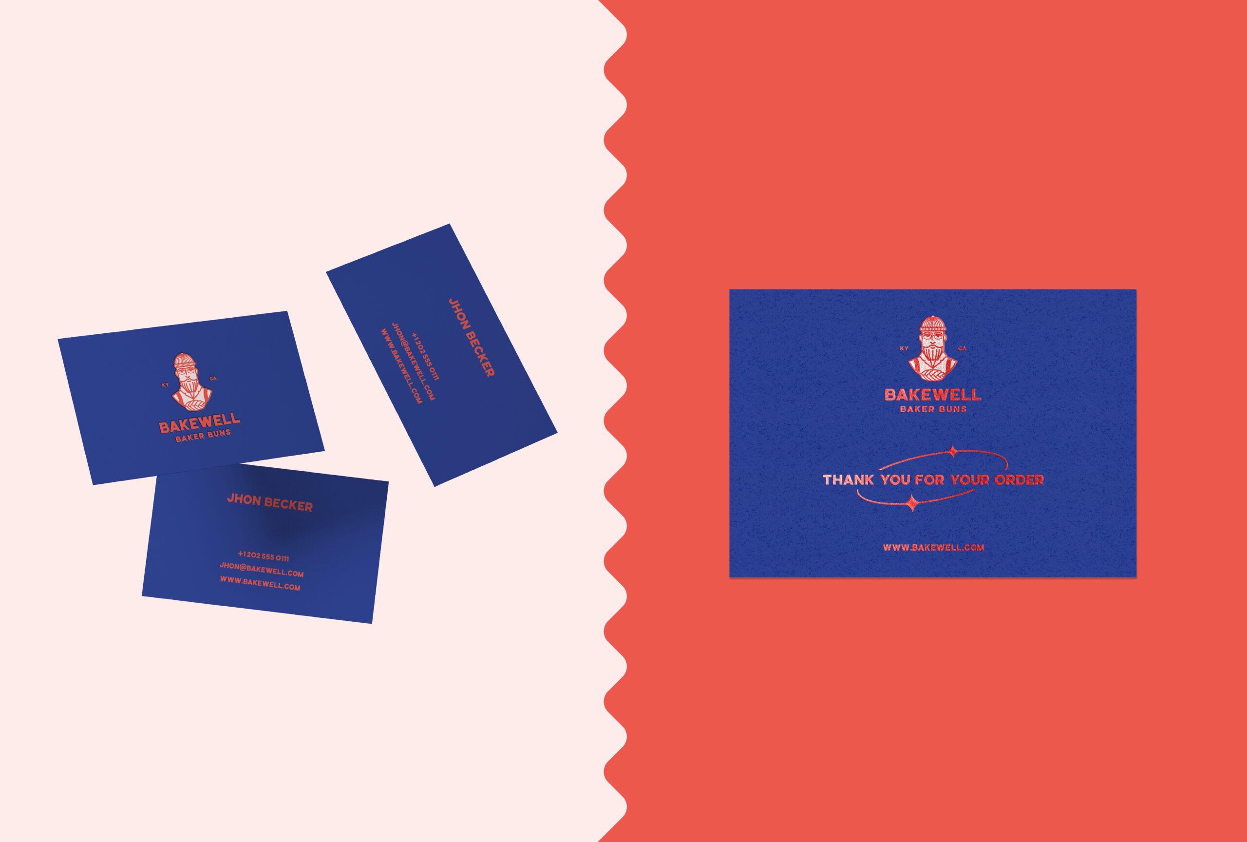
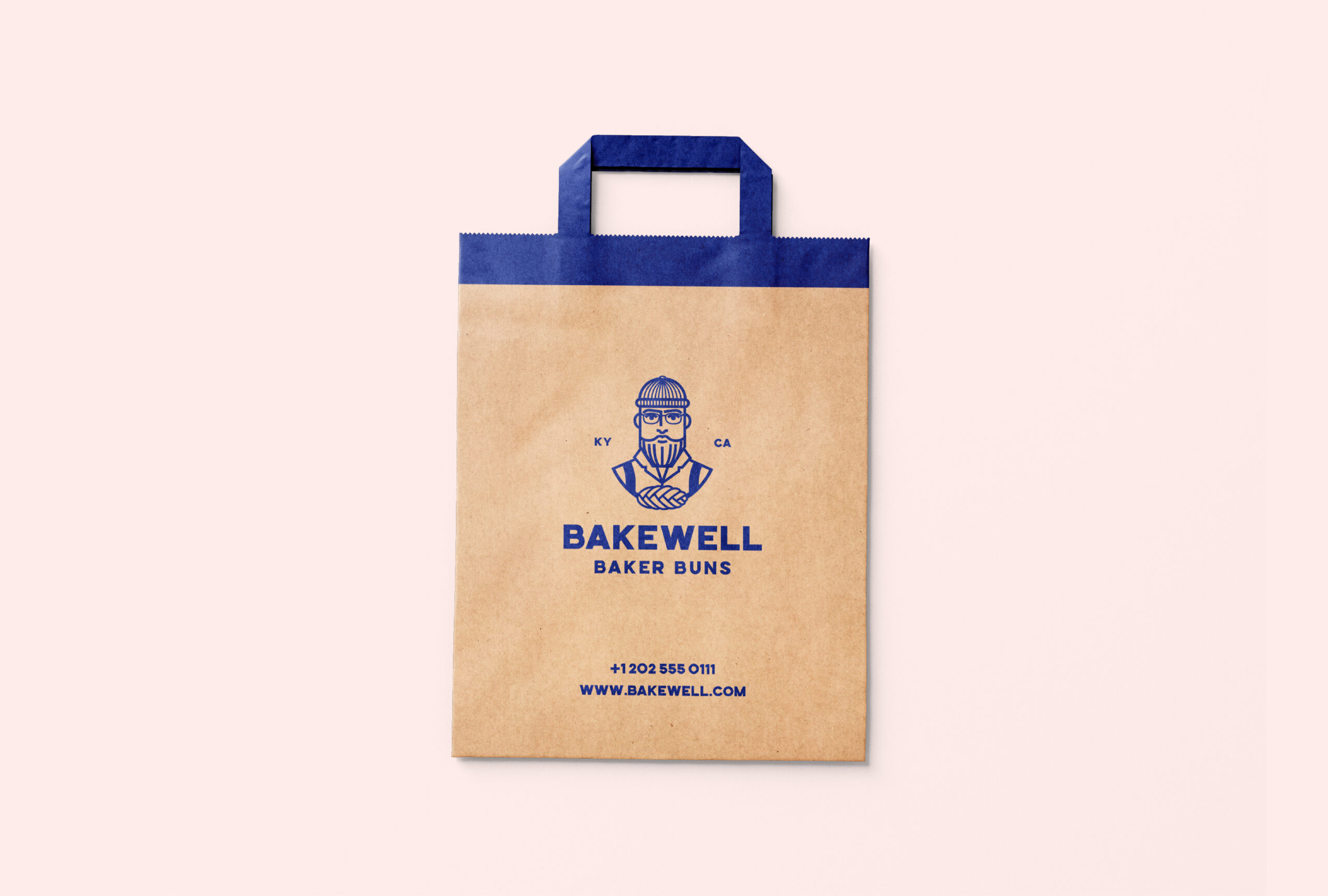
The final brand identity helped Bakewell carve out a distinctive space in the market. The cohesive visual system strengthened its storytelling and built trust with a growing audience of bread lovers. With packaging that invites curiosity and a voice that feels familiar, Bakewell now communicates its values with confidence and warmth.
Client:
Bakewell Baker Buns
Date:
July 2022
Location:
Kentucky, United States


